How might we create a unified permission request system that prevents prompt fatigue?
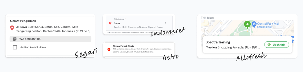
Allofresh map picker and how it can hurts business
Reduced API costs by millions annually
Improved SLA by 14% by preventing user error
Enhanced the design system by creating more scalable components
Role
Lead Designer
Scope
Feature Enhancement
Introduction
At Allofresh, our delivery service relies heavily on accurate location data to ensure customers receive their orders promptly. Recently, our product and engineering teams identified two critical issues with our map picker functionality that were significantly impacting both our bottom line and customer experience.
The Problems
🏘️ Address-Pin Location Mismatches
Also alarming was our product team's finding that 8% of our transacting users had mismatches between their full address and actual map pin location. This directly impacted our SLAs, forcing our team to manually resolve issues or risk failed deliveries.
💸 Bleeding Money Through API Interactions
Our engineering team discovered we were hemorrhaging money through our map picker interaction. The culprit? Our implementation of Google Maps' Place Details API. Every time a user dragged the location pin, we were calling the API to fetch place or landmark names – a costly interaction for a naturally high-interactivity feature.
Understanding the Problems
Problem 1: Why Users Have Mismatched Locations
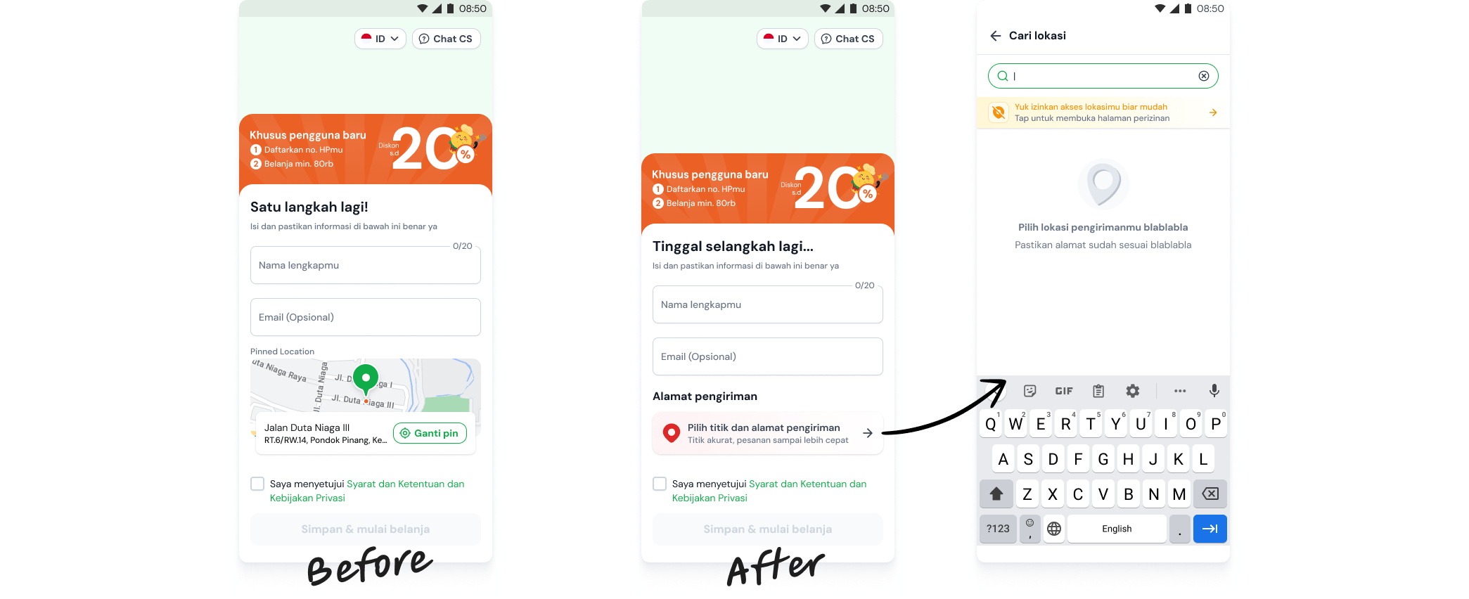
Further investigation revealed that users with address-pin mismatches were predominantly those who had refused location permission access. This led me to audit our current user journey for those who deny location permissions, revealing three critical issues:
Permission Fatigue:

We were repeatedly prompting users to activate location permissions throughout their journey, hoping they will enable the permission.
Default Location Issues:

During registration, location defaulted to "Spectra Training" without requiring user interaction, making it highly probable that users overlooked this critical setting.
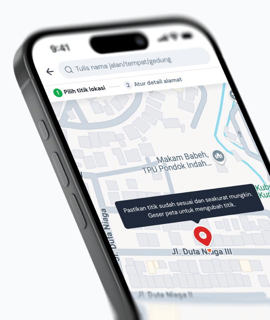
Poor Component Recognition:
High probability that users didn't recognize the Edit Pin Location component due to its design.
Crafting the solution
Permission Fatigue & Default Location
💡
💡How might we make location setting during registration more intentional and noticeable for users?
Initially, these seemed like separate issues, but after revisiting the journey multiple times, I realized they stemmed from the same root cause:
📌Inefficient handling of location permission refusals.
🌟 The Solution: Separation of Concerns
My solution implemented a separation of concerns with a dedicated "Location Off/Fail Mode." Instead of bombarding users with multiple prompts, we focused on properly handling the "location off" state.
UI components would adapt based on location permission status, including scenarios where location is enabled but fetching fails based on API response.
This "Location Off/Fail Mode" was designed with intentionality rather than defaulting to a random location that users might overlook.
Redesigning the Pin Location Component
💡How might we design a more intuitive PIN location editing experience that users can easily recognize and interact with?
🌟 The Solution: Competitor comparison
This solution was straightforward after competitor research revealed key takeaways:
🧐Most competitors use red-colored pin icons for location components
Boxed layouts were standard and vastly different from our current design
By adopting these familiar patterns, we could significantly improve component recognition while reducing development complexity.
Problem 2: The Cost of Interactivity
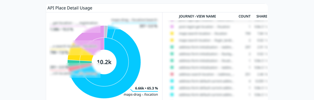
Our map picker design was secretly becoming a money pit. Each pin movement triggered a Place Details API call, and with users naturally adjusting their pins multiple times to find the perfect location, costs quickly accumulated. As our user base grew, this design flaw became financially unsustainable.
Engineering Brief
Kudos to our engineering manager and team for presenting these problems clearly to the product team along with several technical alternatives. After thorough discussions, we made the bold decision to completely eliminate the use of Place Details API, as other solutions either created a janky user experience or introduced new complications.
The Challenge
Removing Place Details API meant we could only display address components without any landmark names. This created our first design challenge:
💡How might we display location information in a way that minimizes user confusion despite the lack of familiar place/landmark names?
Documentation Deep-Dive
Being unfamiliar with Google Maps API, I dove straight into the documentation. I then consulted my understanding to our engineering manager with specific questions like:
🤔"Can this particular API response be useful?"
"Does this quick mockup still align with our goals?"
"Are there any gaps in my understanding?"
“…”
These consultations built my confidence to begin crafting a solution.
Design Implementation
Introducing intentionality
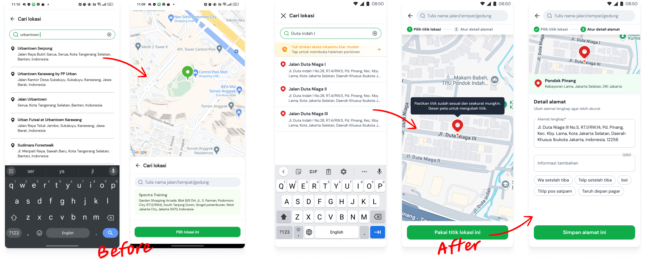
For Location services disabled users, we removed the default location selection capability. Instead, we provide a clear call-to-action prompting them to manually search for their current location. This approach prevents users from proceeding with submissions without actively choosing their location, eliminating the risk of default addresses being incorrectly set as their primary address.
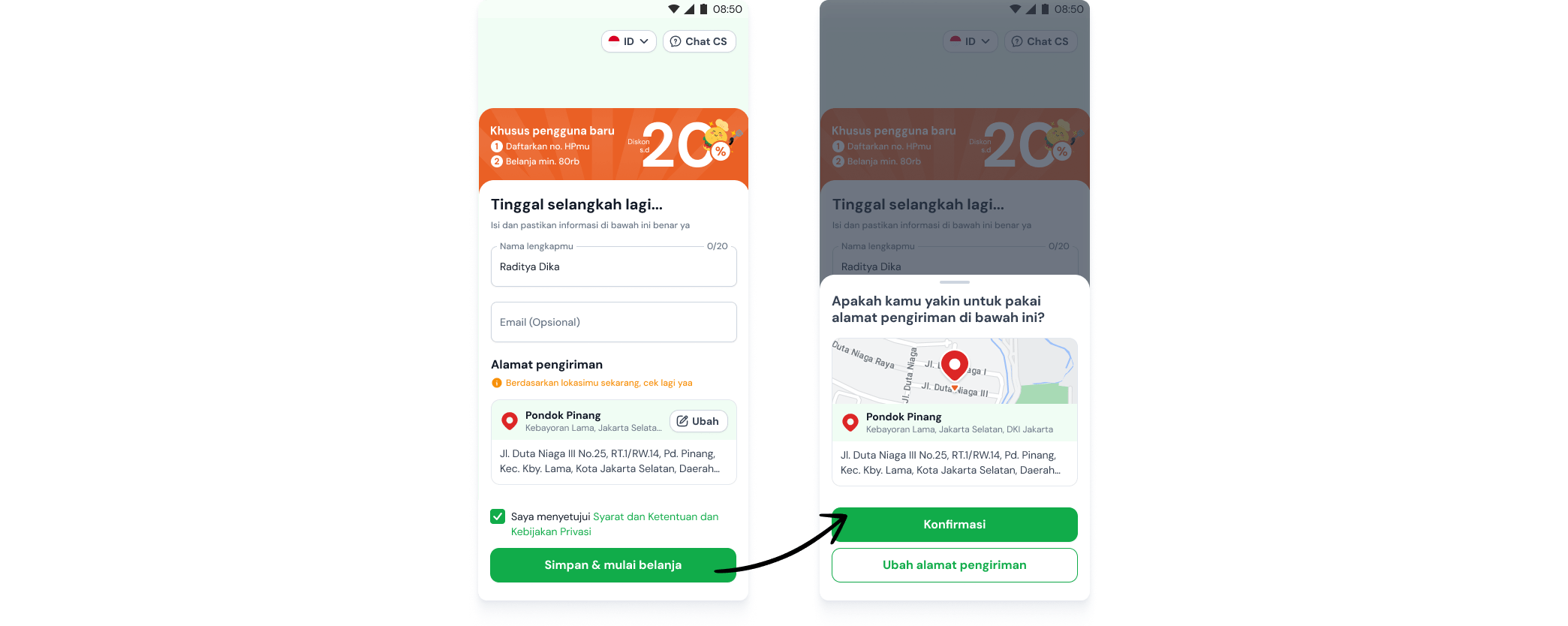
For location services enabled users, a confirmation dialog will appear if they haven't interacted with the address card component. This ensures users are fully aware of their selected location before proceeding.
Familiarity and scalability
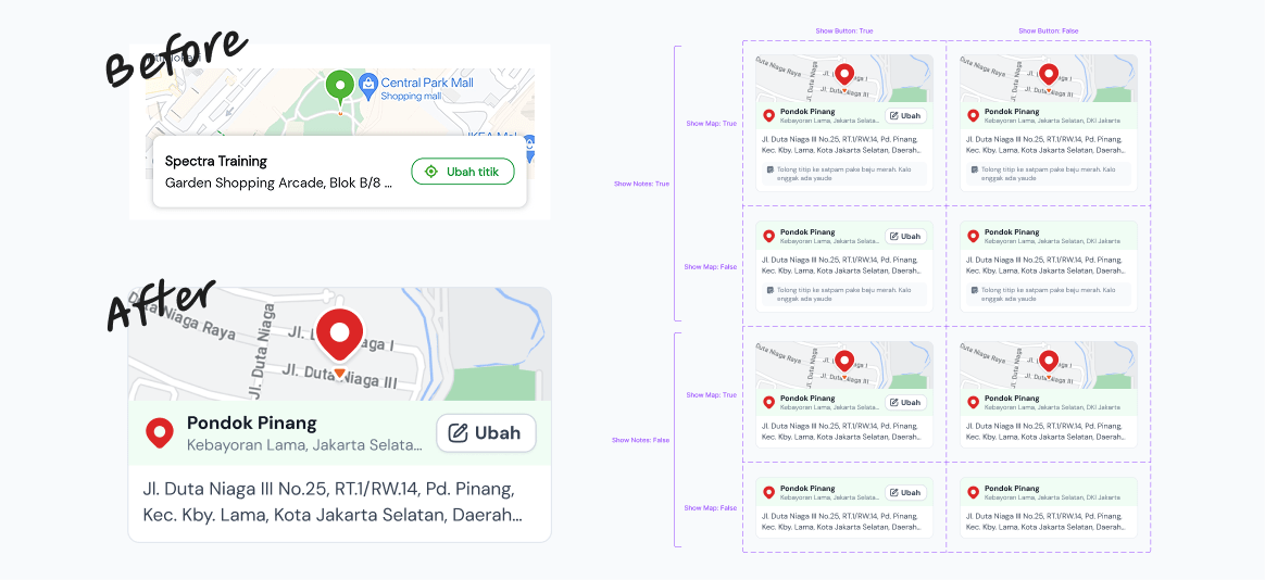
Redesigned the component to better align with user expectations based on our competitor analysis findings. The new design is both familiar to our users and scalable, functioning effectively across various screens as either an interactive element or an informational display.
Closing the wound
To preserve a positive user experience, we found it necessary to completely redefine our Address Flow principles.
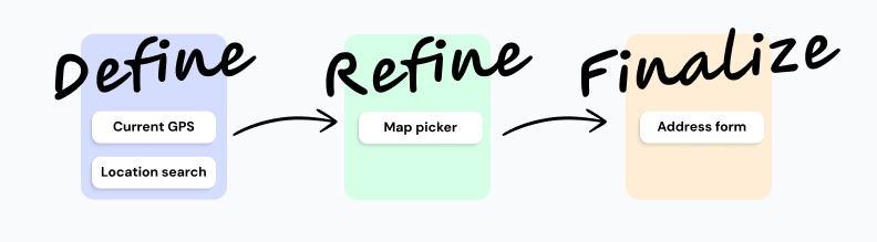
To establish their location, users first conduct a keyword search or utilize their current GPS position (when available) to confirm their intent to use a specific address. Following this, the map picker functions as a refinement stage for pinpointing a more precise location. Finally, users complete the address form to finalize all necessary address details.
Results:
Although the previous design offered superior UX with its single-step approach, it proved too costly to maintain. We made the strategic decision to divide the location selection process into multiple steps.
Key learning
📌Sometimes the best solutions come from recognizing that separate problems share a common root cause.
📌Even seemingly minor UX decisions (like API calls on map interactions) can have significant business impacts
📌Default settings require special attention as they often go unnoticed by users
You've reached the end.